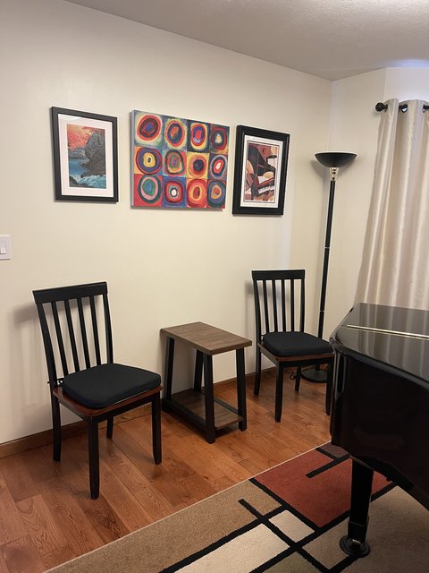
Help me think about how to decorate my piano room
-
I'm guessing that I grew up with a completely different approach to furnishing a room than Mr SK did, so I'm we are likely to have different opinions on the furniture placement.
Function is as important to me as aesthetics. If I were a guest, I would feel odd sitting down by myself in a single chair without the chance of having someone else to join me. I think I've been tainted for life by my Mom's reaction to Mr Ilg, her interior decorator, when he waved his hand up and down in the general direction of the corner of the living room and said "we could do a tall dramatic chair here". 1960s, so you can imagine. It would probably have been velvet. To which my Mom replied: "Who is going to sit all by themselves in the tall dramatic chair?"
 What she ended up doing was a corner arrangement of two small but exceedingly comfy chairs with a table and lamp in between. It was the first place people gravitated to upon entering the room.
I think a grouping of two chairs with a small table in between creates an inviting conversation area. You walk in and put your beverage and/or snack down on the table (bonus: a place to put things down that isn't the top of the piano!) Another guest comes in to join your and you can chat in between listening to whoever is playing the piano.
I would also put a small table next to the red chair, again for the place to put down your "stuff".
-
I'm guessing that I grew up with a completely different approach to furnishing a room than Mr SK did, so I'm we are likely to have different opinions on the furniture placement.
Function is as important to me as aesthetics. If I were a guest, I would feel odd sitting down by myself in a single chair without the chance of having someone else to join me. I think I've been tainted for life by my Mom's reaction to Mr Ilg, her interior decorator, when he waved his hand up and down in the general direction of the corner of the living room and said "we could do a tall dramatic chair here". 1960s, so you can imagine. It would probably have been velvet. To which my Mom replied: "Who is going to sit all by themselves in the tall dramatic chair?"
 What she ended up doing was a corner arrangement of two small but exceedingly comfy chairs with a table and lamp in between. It was the first place people gravitated to upon entering the room.
I think a grouping of two chairs with a small table in between creates an inviting conversation area. You walk in and put your beverage and/or snack down on the table (bonus: a place to put things down that isn't the top of the piano!) Another guest comes in to join your and you can chat in between listening to whoever is playing the piano.
I would also put a small table next to the red chair, again for the place to put down your "stuff".
I don't think it looks too crowded with the two chairs, I think it looks "intentional" -- like, this is a place for two people to sit. I think to Mr SK it looks like "you didn't have anywhere else to put those chairs, so you shoved them in there"

@wtg said in Help me think about how to decorate my piano room:
I think two chairs with a small table in between creates an inviting conversation area.
I love this idea, but I'm worried it's not quite roomy enough for the table in between... I'll play around with items I already have in the house and see what it looks like.
What do you think of those chairs I posted? (the parsons chairs, not the ones I already own) I'm trying to keep the footprint shallow, and an accent chair like the red one I have has a much larger (deeper) footprint. Maybe there's a different style I should consider?
-
Indeed, it doesn't look crowded to me at all. Without a table I do think they look a little lonely.
There are some very small decorative tables you could put in the middle. I'll find an example or two... and post them.
This isn't the reading nook where someone will spend a few hours. It's just a place to land for a period of time to listen to the pianist and to socialize with other guests. I think any of them would work fine; the smaller size of a dining chair is ideal for the available space.
-
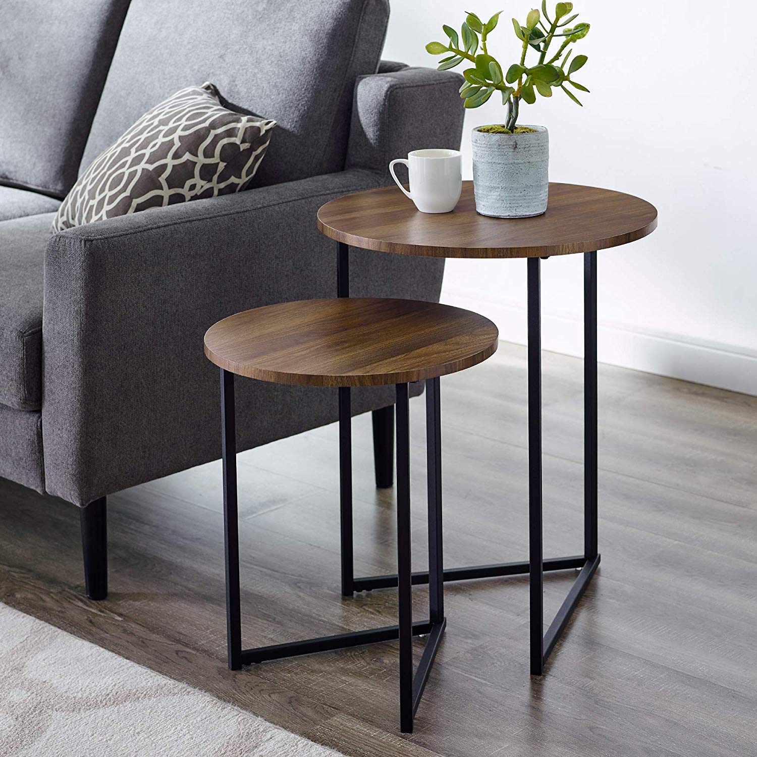
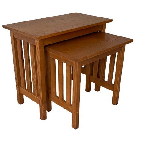
Some small nesting tables. One could be between the dining chairs and the other could be moved to the red chair, maybe as needed.
Round:

Rectangular:

I have these. Got them from LLBean years ago. They're not very big at all.

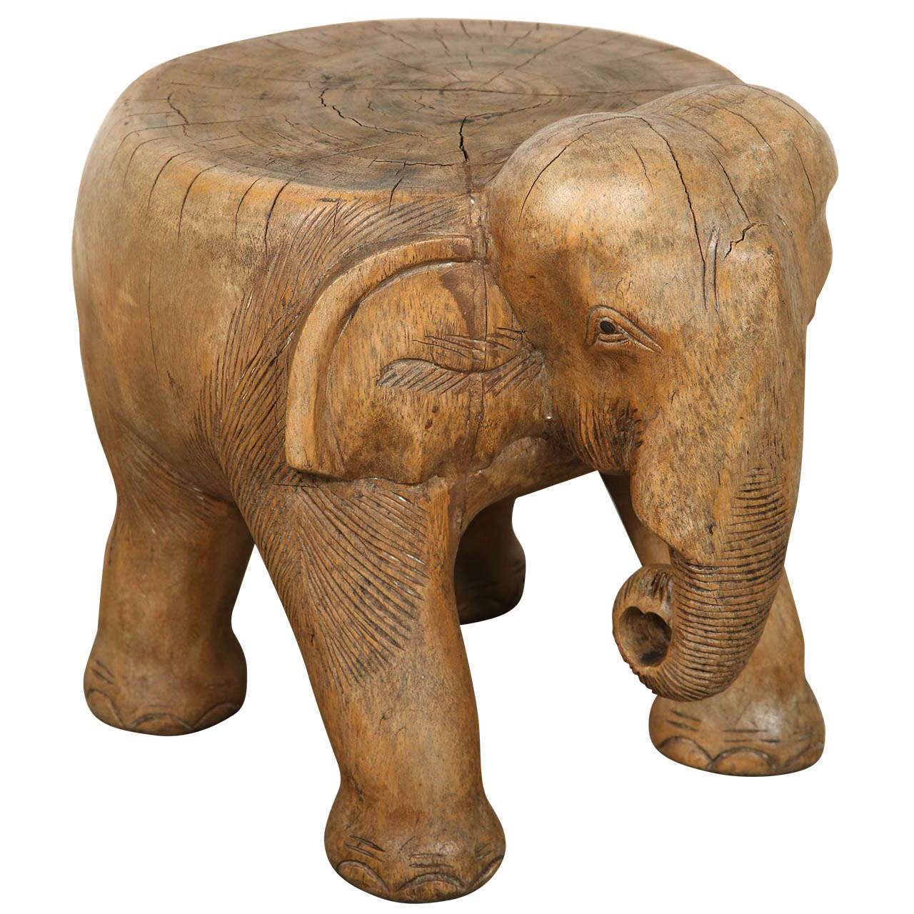
We have something like this (they come in various sizes), but you may not want to introduce the animal element:

-
Do a little role playing. He's a guest who has come for a piano gathering. Hand him a cup of tea and a couple of cookies on a plate and send him in there with one chair and no table. Play a few pieces on the piano. Like 20 minutes worth.

@wtg That's some fairly devious thinking.

I do prefer the uphostered chairs you posted rather than the dining room chairs as they will be comfortable for longer musical sessions.
I think it has come together very nicely. I'd give it a little time to see what experience may have to say about the room and how it works for different occasions before I would commit to a "final" design.
Big Al
-
I like the art a lot, especially the big piece you got from AtHome -- someone said above that it looks like your rug reflected in water and I totally agree -- it matches your rug so well!
I like the red chair on the short wall a lot!
I do think the 2 dining chairs with so much space between them is odd, but I think getting comfier-looking chairs (those definitely look like dining table chairs, whereas the parsons style you posted --especially the 2nd one with the nailhead back-- looks more living-room-y), turning them slightly toward each other so the two people sitting in them could talk, and putting a little table like WTG suggested between them would work well. Right now, the way they are lined up along the wall and awkwardly spaced apart remind me of two people waiting for the firing squad, LOL.
You could even do a tiny little plant stand/garden stool type table - just something so people can put their drinks down. I kinda like this one, but there's tons of different shapes/styles/colors: https://www.wayfair.com/furniture/pdp/world-menagerie-amedee-ceramic-garden-stool-w005483397.html?piid=2027484986
Again, I'd suggest Homegoods/TJMaxx etc for potential pieces - they usually have tons of occasional table type things. Or perhaps try a vintage store/flea market -- I have a few vintage small brass stool/tables that I love - they are tiny enough to be plopped down next to any chair in the house. LIke this (only I paid like $10 for mine, not $550!!!): https://www.1stdibs.com/furniture/seating/stools/mid-century-hammered-brass-stool-side-table-sarreid/id-f_713235/
-
If I were to attend your recital, I’d want chairs with arms, and a table between them.
-
I like the art a lot, especially the big piece you got from AtHome -- someone said above that it looks like your rug reflected in water and I totally agree -- it matches your rug so well!
I like the red chair on the short wall a lot!
I do think the 2 dining chairs with so much space between them is odd, but I think getting comfier-looking chairs (those definitely look like dining table chairs, whereas the parsons style you posted --especially the 2nd one with the nailhead back-- looks more living-room-y), turning them slightly toward each other so the two people sitting in them could talk, and putting a little table like WTG suggested between them would work well. Right now, the way they are lined up along the wall and awkwardly spaced apart remind me of two people waiting for the firing squad, LOL.
You could even do a tiny little plant stand/garden stool type table - just something so people can put their drinks down. I kinda like this one, but there's tons of different shapes/styles/colors: https://www.wayfair.com/furniture/pdp/world-menagerie-amedee-ceramic-garden-stool-w005483397.html?piid=2027484986
Again, I'd suggest Homegoods/TJMaxx etc for potential pieces - they usually have tons of occasional table type things. Or perhaps try a vintage store/flea market -- I have a few vintage small brass stool/tables that I love - they are tiny enough to be plopped down next to any chair in the house. LIke this (only I paid like $10 for mine, not $550!!!): https://www.1stdibs.com/furniture/seating/stools/mid-century-hammered-brass-stool-side-table-sarreid/id-f_713235/
@Lisa said in Help me think about how to decorate my piano room:
I like the art a lot, especially the big piece you got from AtHome -- someone said above that it looks like your rug reflected in water and I totally agree -- it matches your rug so well!
Ha, that was me!
I like the red chair on the short wall a lot!
Me too!
I do think the 2 dining chairs with so much space between them is odd, but I think getting comfier-looking chairs (those definitely look like dining table chairs, whereas the parsons style you posted --especially the 2nd one with the nailhead back-- looks more living-room-y), turning them slightly toward each other so the two people sitting in them could talk, and putting a little table like WTG suggested between them would work well.
Yes to all this. We have a set of nesting tables that I “borrowed” from my mom; one is between the two red chairs under the Gorman lithograph, one is next to the sofa (you can see a pdx carpet coaster on it at the far left of the picture), and I think the other one (two?) are still at Mom’s house. But the little scatter nesting tables are great.
-
Lisa, I won’t use the chairs in the photo, they are in service elsewhere. But the upholstered chairs have a similar footprint so I think they’ll work.
@wtg this pic shows a small table (in service elsewhere) that I bought at your recommendation (not this specific table but you rec’ed I find a table) when I first got this chair!

It happens to be one of my favorite tables now.Anyway I tried this:

I think this would work with a small round table (and the upholstered chairs)
-
I think a high top bistro table with two chairs would work very well.
Facebook Marketplace.
-
this pic shows a small table (in service elsewhere) that I bought at your recommendation (not this specific table but you rec’ed I find a table)
What can I say? I'm stuck in a rut.

I know you said you might do round, but if you did rectangular I think I'd turn it 90 degrees. Maximizes space for each of the people sitting in the chairs to put something on the table without one of them having to reach to the wall to get to their glass or plate.
I think a high top bistro table with two chairs would work very well.
That's an interesting idea, and I'm assuming that would be in lieu of the two chairs on the red circles wall. The armless red chair on the adjoining wall has a low profile, though, and I'm having trouble visualizing how the tall table and chairs would look on one wall with something quite low on the adjoining wall.
If I were to attend your recital, I’d want chairs with arms,
the parsons style you posted --especially the 2nd one with the nailhead back-- looks more living-room-y)
No nailhead and it's not black...lol...but might something like this work?

-
@Steve-Miller I like the look of high top chairs, but me and Mr SK don’t like them, probably bc we’re too short! So that’s a no-go for us.

I wonder if a 12” or so square table might be nice, instead of round maybe
-
@Steve-Miller I like the look of high top chairs, but me and Mr SK don’t like them, probably bc we’re too short! So that’s a no-go for us.

I wonder if a 12” or so square table might be nice, instead of round maybe
I wonder if a 12” or so square table might be nice, instead of round maybe
Or this. I would pick a black frame and espresso top:
-
@ShiroKuro said in Help me think about how to decorate my piano room:
@wtg I’ll check the footprint on a chair like that.
I think it's a dining chair with arms so the footprint should be the same.
-
For the chair, something like 21"D x 18" W x 38" H. That's truly dining room chair size, it could be a little wider to accommodate the arms, but I don't want it to be much deeper. And it's tricky because depending on the angle of the back, the actual footprint could be larger. Like this chair, it's most certainly more than 19.7" deep, but the dimensions don't make that clear.

This chair's info does a better job:

Hello! It looks like you're interested in this conversation, but you don't have an account yet.
Getting fed up of having to scroll through the same posts each visit? When you register for an account, you'll always come back to exactly where you were before, and choose to be notified of new replies (either via email, or push notification). You'll also be able to save bookmarks and upvote posts to show your appreciation to other community members.
With your input, this post could be even better 💗
Register Login