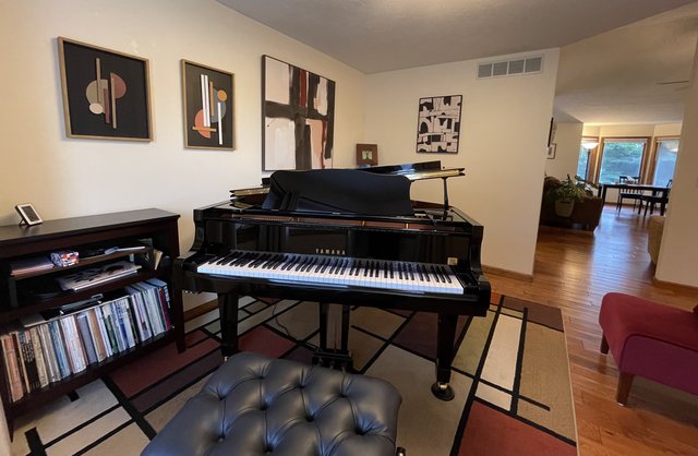
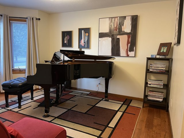
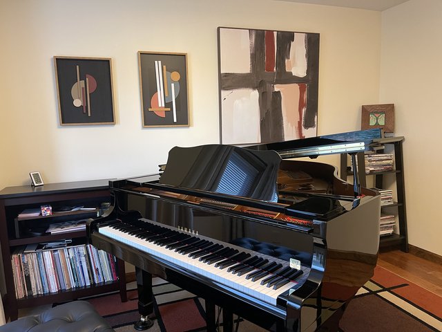
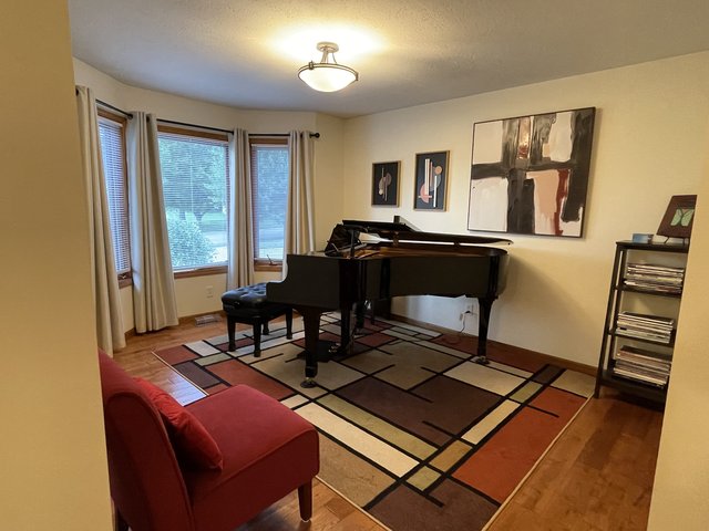
Help me think about how to decorate my piano room
-
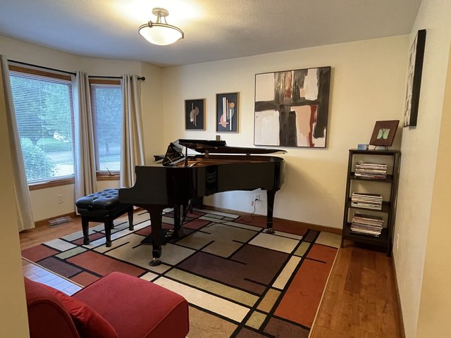
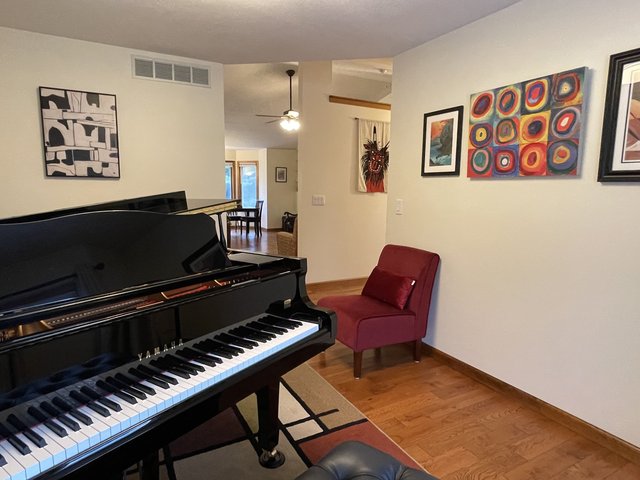
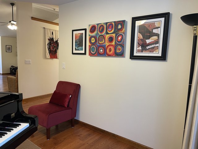
I have a hard time visualizing...could the 3D pieces work if they're both rotated 90 degrees, and then stacked one above the other, probably smaller one on top ? Big square piece on the left as you have it in photo 1, and the other two as a group off to the right. Would have to experiment with spacing, my first thought would be to have the two smaller pieces centered in the rightmost third of the wall.
-
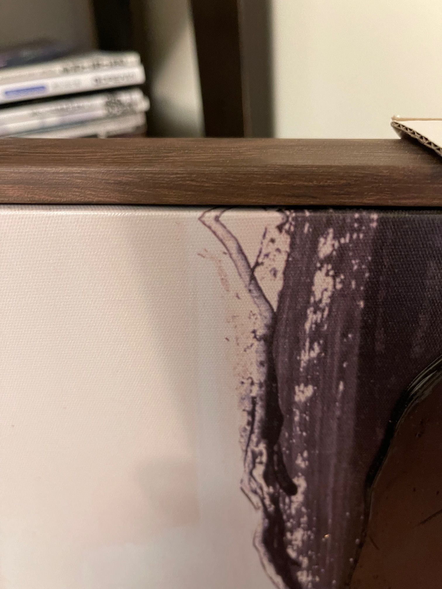
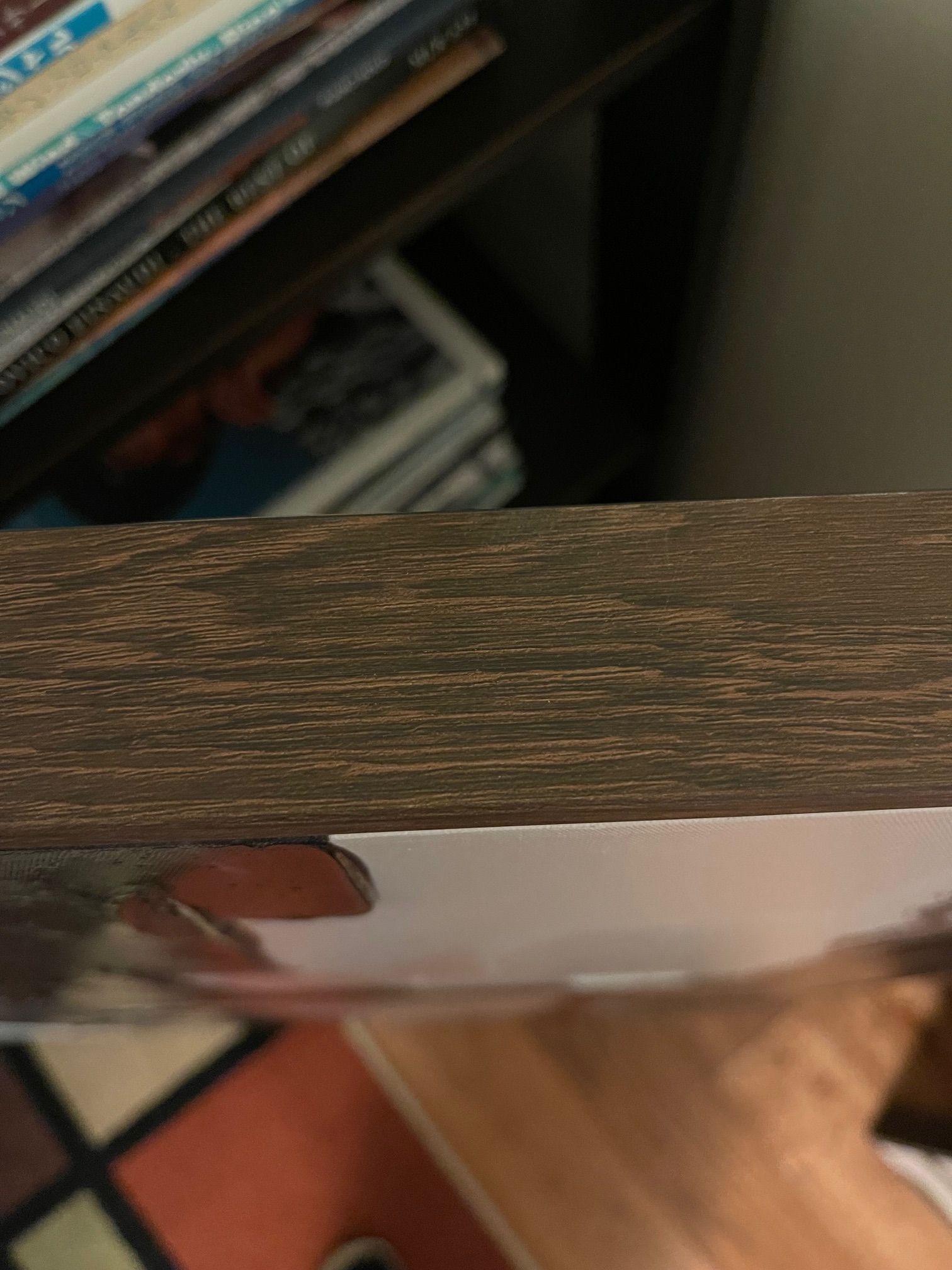
I had purchased something not unlike your red circles picture from Z Gallerie. Something was missing for me, and I ended up building a 1"x2" frame with simple butt joints that I fastened with pocket screws. The frame was a couple of inches bigger on all sides than the size of the art. I painted the frame in a color that worked with the art. Then I screwed my homemade frame to the back of the art piece (which had a wooden frame that the canvas was mounted to). The art on top of the painted frame gave the whole thing more depth, more 3D.
I'll see if I can find a pic of something similar...
@AdagioM said in Help me think about how to decorate my piano room:
(which I suggested; I take it back!)

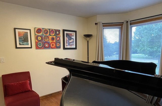
Yeah, option 1 works better, even with the piano closed. But also, I like how it looks to me when I sit at the piano.
@wtg said in Help me think about how to decorate my piano room:
Z Gallerie
Yikes, there are tons of things on that site that I love, but they're out of budget for now!

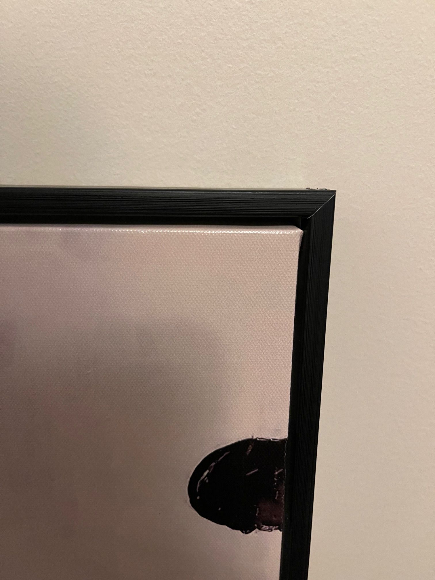
I like your idea of building a frame for that canvas, it would look better with a frame. Maybe we'll put it on the wall for now and add the frame later.
The other two canvases that will go in the piano room both have very simple frames, but it sort of finishes the piece.
-
I like option 1 as well, but I feel like instead of it looking so much like a group of 3 that gets bigger as it grows across the wall, it might be cool to separate them a bit, so that the group of 2 3d pieces is closer together at the bench end. In other words, more space between those 2 and the big one so it looks like 2 distinct areas of art work that are separated instead of a group of 3 pieces. Maybe you could try staggering the group of 2, either one on top of the other or diagonally kind of. I'm probably not explaining this well. I do like that large piece a lot and I like the 3d pieces as well and the 3 of them complement each other so I think you have good pieces - it's just a matter of figuring out placement.
I like the circles piece - it picks up the color of the chair. I would probably center it over the chair (or center the chair under it). But again, because the 3 pieces you are thinking of on that wall are such disparate styles, I don't like the way it the pictured arrangement looks like its trying to be an evenly spaced group of 3. I would either try to put more space between circles and the other 2 or maybe hang those 2 framed pics on the other wall (the one that you face when sitting at the piano). What did you plan to hang on that wall again? (Also, I really do like that yarn thing Steve found -- I think that could look really cool next to the circles piece if you could find colors that match it or maybe something that incorporates some of those colors and some of the more muted colors in the rug to tie everything together.)
-
-
That would be fairly easy to make yourself with just some basic tools. If you didn't want to attempt the fancy mitre joint (the way the horizontal and vertical pieces meet in a diagonal line) you could even just piece together 2 horizontal and 2 vertical pieces of 1x2 or 1x3 depending on how thick the canvas is. If you don't have a saw, get them cut in advance at Lowes/Home Depot and use angle brackets (you'd need a screwdriver and perhaps a drill for a pilot hole) on the back to assemble them -- these things: https://www.amazon.com/DGOL-Corner-Braces-Picture-Bracket/dp/B095GLLP15/ref=sr_1_4?crid=2681WCPXUQDLW&dib=eyJ2IjoiMSJ9.1tFQpAHZ8Mq5vOUAKTSL-9AGNKVwtOpnoFDrs2IZ-KBNfrXpPG4c-JFsVJY1koWy_Li2qC7zCeCbn7BntSsYCYtF4gTDod0OiQMpWlS0X2V1qtbg9H51HS_DKgdI02ECiE5S92-RaxYVamIuc-Yic9d0O_A-UxC1TuVx3zCLR9AeoKBu8UpNa7ZG2evcSKRXyiiTIjWdR41c3PUvWd_kMJgEkVs89TSz5wdm5pGtlgE.08b6PdI6M9VWYFJjVbgWeqsxnP3Dmszj3xJ2Uf_Gy0Q&dib_tag=se&keywords=flat%2BL%2Bbrackets%2Bto%2Bjoin%2Bwood&qid=1719582294&sprefix=flat%2Bl%2Bbrackets%2Bto%2Bjoin%2Bwood%2Caps%2C105&sr=8-4&th=1
With a coat of black paint, it wouldn't be super obvious that you don't have mitred corners and you could basically pull it off for under $25 or so. Getting it framed professionally would be a lot more $$$$ but would obviously be a more polished look.
-
What @Lisa describes is what we did with the Z Gallerie piece, except that we used a Kreg pocket hole jig that we already had instead of the angle brackets. The butt joints are pretty much invisible when the piece is painted.
The angle brackets are a great lower cost alternative if you don't have a Kreg.
BTW, @ShiroKuro ...I can't believe the prices at Z Gallerie. Granted it was some years ago, but I paid $99 for the piece I bought at their Woodfield Mall store...
-
Hmm, maybe we'll (ok, not "we," but Mr SK) will actually try to do the frame now, rather than hang it first. I bet he could do it very easily!
@wtg re those prices, yeah, amazing! And I thought Art dot com was expensive! The things I liked were priced in the four digits!!
Thanks to everyone's advice in this thread, I got four pieces for less than $200. Much better! (I'm saving my four-digit expenditure for a sofa for Mr SK!!)
-
BTW, the piece I have is 28 x 22, so no kits on Amazon in that size. Other places online are in the neighborhood of $100, which defeats the purpose of DIYing this... Although maybe if I could fint one closer to $60...
Anyway, we'll start with Lowes and see how we do.
-
BTW, the next thing to add is another chair to go to the right of the red chair. After I took these photos, I brought in a medium sized chair from the living, and that fills that hole quite nicely, so I just need to get another one. And a chair for the tail end of the piano as well...
-
Thank you!
@wtg said in Help me think about how to decorate my piano room:
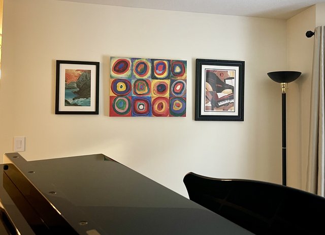
Looks good! The red circles between the framed pieces worked out well.
Yeah, I like that order. I don’t like how lined up it looks at the bottom, but when I get another chair in there, I think it will be good.
-
@AdagioM Good question! Matching chairs could be nice actually. Although it’s not as roomy as it looks in the photos, so the footprint of the chair is important. My funky rocking chair (which is in the living room) fits there at an angle, but other chairs might not work that way. And a regular armchair or plush chair would probably be too deep…
Way back in this thread (I think) @wtg suggested a little shelf or table plus chair IIRC and I said thst wouldn’t work, but now that everything else is in place, maybe it would…
Hmm…
-
Looks great!

-
Would it look weird to have “dining chairs” like this in the piano room? Either one or two. (I would what black probably, not gray, but this is the style)
https://www.athome.com/providence-amina-dining-chair-charcoal-grey/124353350.html?nav=search

