Help me think about how to decorate my piano room
-
So, I think the big square one will work behind the piano:
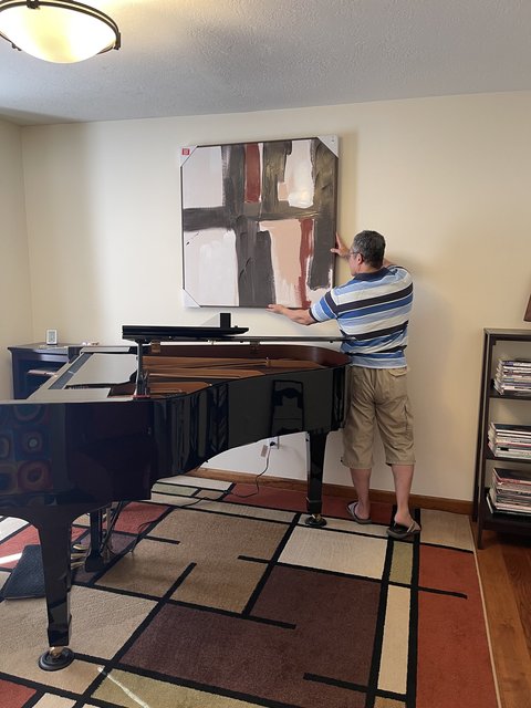
Could I put those black ones on either side, or maybe not have the square one centered, and have the black ones staggered on one side? No, weird?
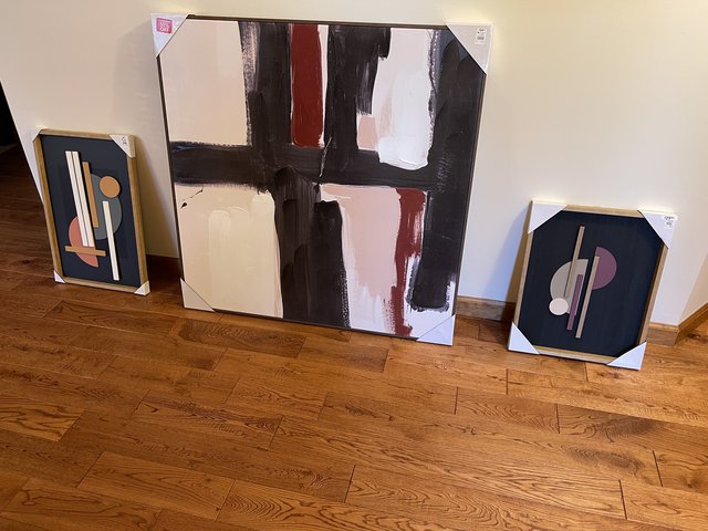
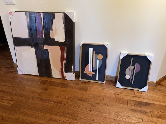
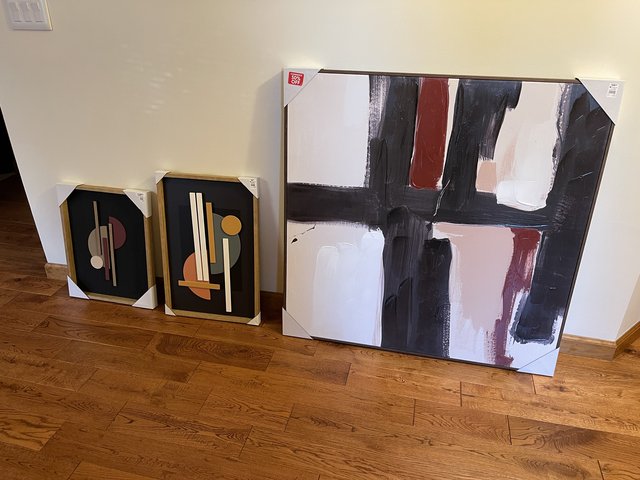
I don't think they'd work on the same wall as the circles:
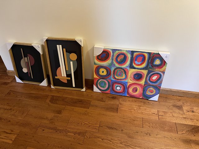
Any thoughts?
-
Maybe the square one can go towards the piano's tail and the two black ones can go over the shelf that you can't really see that's in the back left corner of the photo w/ Mr SK in it. The two black ones are not the same size, and I think they'd look good staggered... Then I could put the circles on the opposite wall from the square one so that I could see it when playing... Or on the back wall/...
Hmm. Maybe tmrw I'll go back to powerpoint...
-
Thanks for the suggestion! I think you’re right, putting the black ones in either side of the square one will look weird.
Also, I don’t have to put those black ones on that wall, they could go on a different wall as well…
I think tmrw I will see if I can make a few virtual options to help me decide which works best.
-
Well, I printed out all the new artwork on printer paper — and finished printing just before the power outage! Then, since there was nothing to do during the outage, I got all the paper prints cut and taped together — that’s five test prints, which was pretty time-consuming! So now Mr SK and I will put them up on the walls in the piano room (using painter’s tape) and try different configurations. So stay tuned!

-
How about something like this? You can have them made in any size and colors you want.
From Etsy
(https://i.etsystatic.com/16737590/r/il/a028ee/2827175854/il_794xN.2827175854_d2dv.jpg)
-
-
The lady we’ve bought from in the past will make a custom one based on a picture you send her. Not sure if the link is to that seller, but Etsy has several sellers who make them.
I think using some of the colors from the rug would look really good.
-
Ok, I think I am mostly settled on what is going to go in this room! Now I just have to decide the placement.
These colors are not accurate, because these are print-outs. The largest print is the worst. But when I look at the real print, I think the colors work.
So for the wall behind the piano, I'm leaning toward option 1. For one reason, I like this one best in terms of my view from the bench. Also, I think it works better when the piano is open.
Option 1:
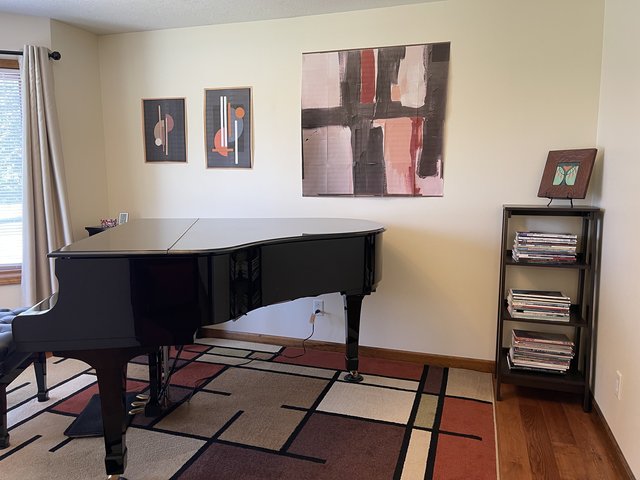
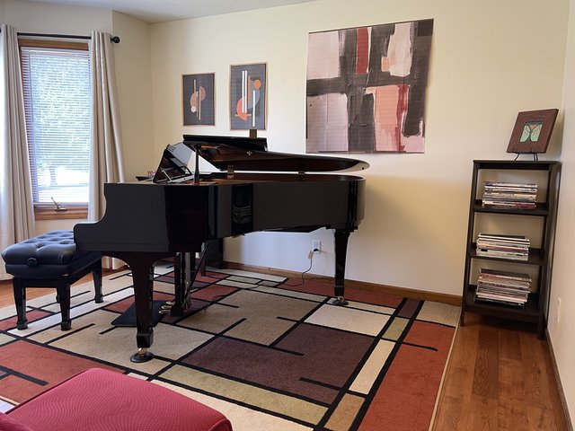
Option 2:
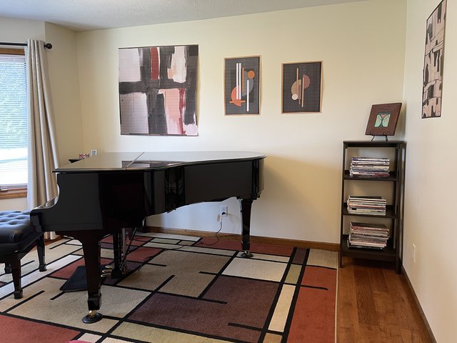
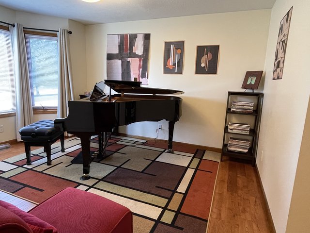
In the Option 2 pics, you can sort of see the B&W piece that will go on the right hand wall.
And this is what will be on the wall opposite:
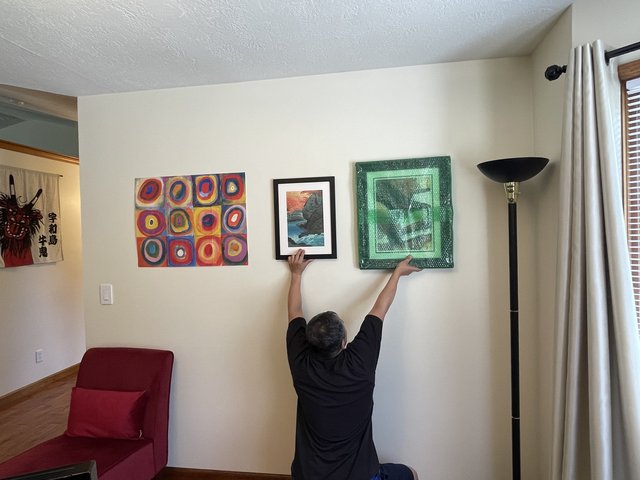
(note that's bubble paper on the right hand print, it's not really green).
I suspect this combination of art might seem over the top, or people might just not like the pieces, but I love them so hopefully it's not so horrible...
Anyway, if you have any thoughts about option 1 versus option 2, please let me know!
-
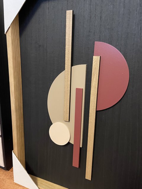
I have a hard time visualizing...could the 3D pieces work if they're both rotated 90 degrees, and then stacked one above the other, probably smaller one on top ? Big square piece on the left as you have it in photo 1, and the other two as a group off to the right. Would have to experiment with spacing, my first thought would be to have the two smaller pieces centered in the rightmost third of the wall.
-

I like groups of art pieces but something isn't quite working for me. Not sure if it's that two of three seem to have glass and are framed, and the third is a frameless abstract. Did you try just two of those three on the wall? Maybe leave the smallest (center) one off and reposition the other two so they are spaced evenly on the wall?
Will the chair be centered under the left one? A little part of me thinks I'd swap the two pics so that the red elements (chair and circle art) are divided rather than stacked.
And will there be some kind of small table or bookshelf on that wall? Have to admit, I'm not sure about that music shelf that's on the opposite wall. It seems kind of stuffed in the corner there. Have you tried it on the adjacent wall, or maybe on the wall in the photo above?
-
I have a hard time visualizing...could the 3D pieces work if they're both rotated 90 degrees, and then stacked one above the other, probably smaller one on top ? Big square piece on the left as you have it in photo 1, and the other two as a group off to the right. Would have to experiment with spacing, my first thought would be to have the two smaller pieces centered in the rightmost third of the wall.
Thanks wtg, this is helpful!!
@wtg said in Help me think about how to decorate my piano room:
could the 3D pieces work if they're both rotated 90 degrees
Interesting! I'll try that (I still have the paper prints of course)
@wtg said in Help me think about how to decorate my piano room:
I like groups of art pieces but something isn't quite working for me. Not sure if it's that two of three seem to have glass and are framed, and the third is a frameless abstract.
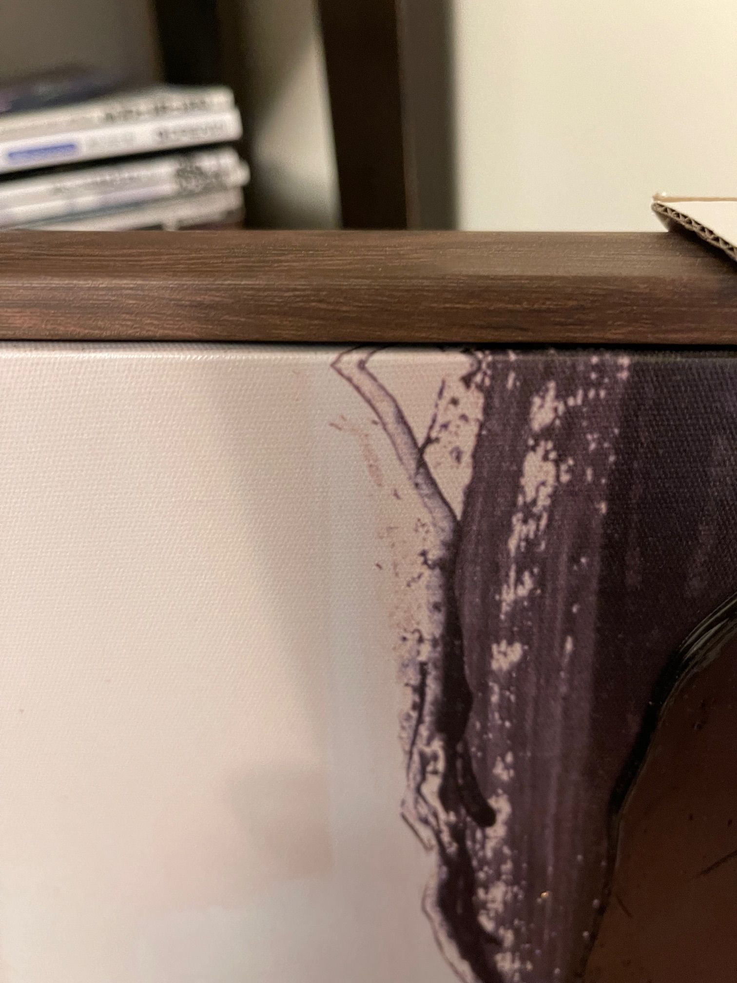
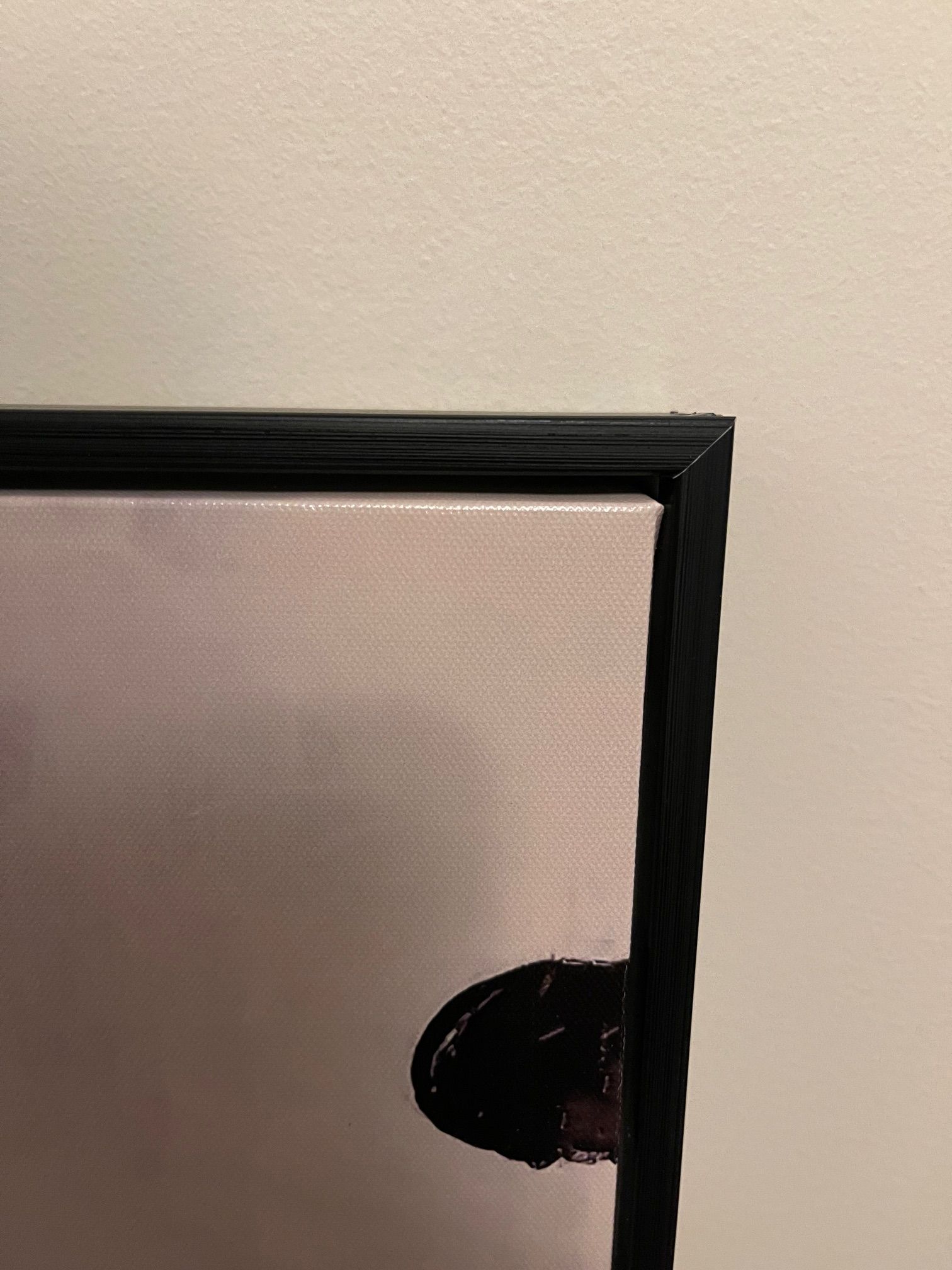
Yes, this is a problem, the two pieces that Mr. SK is holding both have traditional frames and glass fronts. The one still in bubble paper actually has kind of a... not exactly ornate frame, but the frame is scalloped, whereas the other frame is much simpler. So these two pieces are different from the red circles piece, which is just stretched canvas and doesn't even have a frame. BTW the big square piece (on opposite wall) and the black and white piece that I don't have a proper photo of both have a simple frame around the canvas...
Did you try just two of those three on the wall? Maybe leave the smallest (center) one off and reposition the other two so they are spaced evenly on the wall?
I can try that. I have an alternative spot for the smallest one if I don't use it here.
@wtg said in Help me think about how to decorate my piano room:
Will the chair be centered under the left one? A little part of me thinks I'd swap the two pics so that the red elements (chair and circle art) are divided rather than stacked.
Yeah I don't think I like the red and red... But I do want that red circle one out on the end there, since that puts it in my line of sight from the bench, which I like...
This room is pretty small but maybe it would work to slide the red chair in mid-way...
@wtg said in Help me think about how to decorate my piano room:
And will there be some kind of small table or bookshelf on that wall? Have to admit, I'm not sure about that music shelf that's on the opposite wall. It seems kind of stuffed in the corner there. Have you tried it on the adjacent wall, or maybe on the wall in the photo above?
I think it's too tight a fit to add another table or bookshelf... Maybe, I'll ask Mr SK what he thinks. But this way, if I want to have people sitting in here, all we have to do is bring in chairs from the dining room table and put them around in the open space. Or if I ever find a violinist to play with, there's space for that person.
So that's why that bookshelf is stuffed in the corner like that.

-
I have a hard time visualizing...could the 3D pieces work if they're both rotated 90 degrees, and then stacked one above the other, probably smaller one on top ? Big square piece on the left as you have it in photo 1, and the other two as a group off to the right. Would have to experiment with spacing, my first thought would be to have the two smaller pieces centered in the rightmost third of the wall.
-
I had purchased something not unlike your red circles picture from Z Gallerie. Something was missing for me, and I ended up building a 1"x2" frame with simple butt joints that I fastened with pocket screws. The frame was a couple of inches bigger on all sides than the size of the art. I painted the frame in a color that worked with the art. Then I screwed my homemade frame to the back of the art piece (which had a wooden frame that the canvas was mounted to). The art on top of the painted frame gave the whole thing more depth, more 3D.
I'll see if I can find a pic of something similar...
@AdagioM said in Help me think about how to decorate my piano room:
(which I suggested; I take it back!)

Yeah, option 1 works better, even with the piano closed. But also, I like how it looks to me when I sit at the piano.
@wtg said in Help me think about how to decorate my piano room:
Z Gallerie
Yikes, there are tons of things on that site that I love, but they're out of budget for now!

I like your idea of building a frame for that canvas, it would look better with a frame. Maybe we'll put it on the wall for now and add the frame later.
The other two canvases that will go in the piano room both have very simple frames, but it sort of finishes the piece.
-
I like option 1 as well, but I feel like instead of it looking so much like a group of 3 that gets bigger as it grows across the wall, it might be cool to separate them a bit, so that the group of 2 3d pieces is closer together at the bench end. In other words, more space between those 2 and the big one so it looks like 2 distinct areas of art work that are separated instead of a group of 3 pieces. Maybe you could try staggering the group of 2, either one on top of the other or diagonally kind of. I'm probably not explaining this well. I do like that large piece a lot and I like the 3d pieces as well and the 3 of them complement each other so I think you have good pieces - it's just a matter of figuring out placement.
I like the circles piece - it picks up the color of the chair. I would probably center it over the chair (or center the chair under it). But again, because the 3 pieces you are thinking of on that wall are such disparate styles, I don't like the way it the pictured arrangement looks like its trying to be an evenly spaced group of 3. I would either try to put more space between circles and the other 2 or maybe hang those 2 framed pics on the other wall (the one that you face when sitting at the piano). What did you plan to hang on that wall again? (Also, I really do like that yarn thing Steve found -- I think that could look really cool next to the circles piece if you could find colors that match it or maybe something that incorporates some of those colors and some of the more muted colors in the rug to tie everything together.)
-

