Help me think about how to decorate my piano room
-
Ok, this is going to be long, so TIA for reading it!!
So, if I don't need to get more serious acoustic panels for my piano room (and I'm thinking I probably don't), I will want to put some things on the walls in there. But I can't figure out which direction to go with the artwork.
I do think I will do stretched canvas, with or without a frame, but no glass. And I want the pieces to sort of match the rug but not necessarily really "match" the rug...
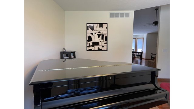
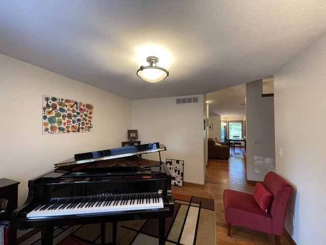
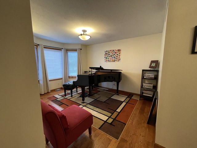
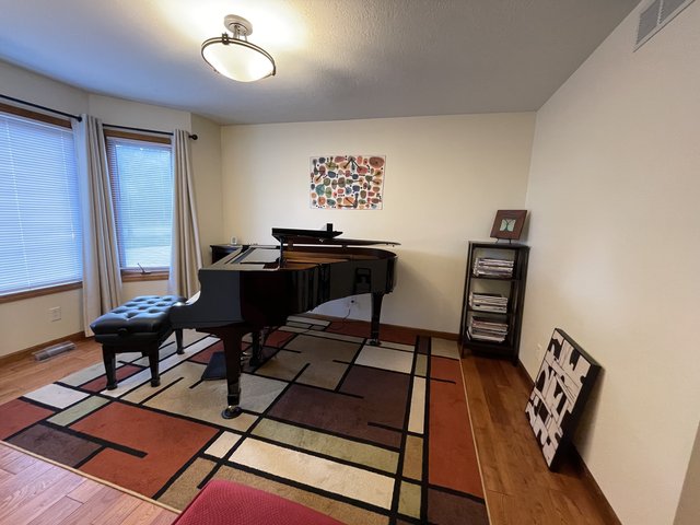
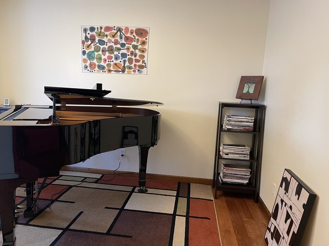
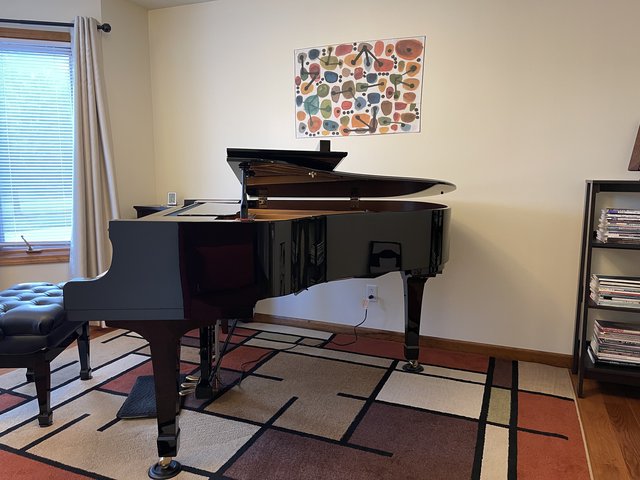
I do have one piece I already own that I know will go on the wall (as it happens, this is stretched canvas w/ a thin-ish frame and no glass). I had this in my previous piano space. Here it is. This is a mock-up, the piece is not actually on the wall yet, but I think this is where it will go, and it's maybe roughly this size...
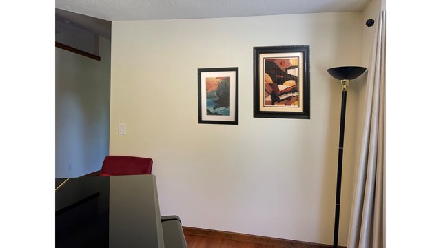
Now here's where it gets tricky. I have these two pieces, which I had on the wall in my previous piano room. But I can't decide if I actually want them on the wall in this room or not.... I might keep the smaller one but not the piano... Although I loved it in the past, now I'm thinking "do I need a print on the wall of a piano in a room that has an actual piano?" So maybe I'd get rid of that?? But anyway, this is the wall on the right, to the treble side of the piano. An important point is that I will see this artwork from the piano, but it's only visible once you're in the room. Oh! And here's the other big deal... This is probably the wall that has the most impact on acoustics (maybe??) so rather than these pieces, maybe this is the wall that needs a big stretched canvas piece??? Anyway, here's that wall with mock-ups of the pieces I already own. I pushed them to the right because I thought I would add something on the left?? And that's a red chair there that you can see the top of
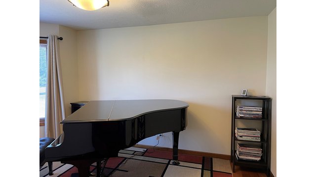
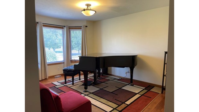
Now here is the wall that I most want to decorate for visual purposes, but I'm not sure how important it is acoustically. But you can see this wall when you come into the house, when you're walking through the entryway etc. It's the most visible because you don't have to enter the room to see it.
Here are two large pieces I thought might be candidates. Although I like both of these specific pieces, I'm thinking of these as concepts, so maybe I'll end up with something completely different, but first I feel like I want to choose which concept I like better....
Colorful:
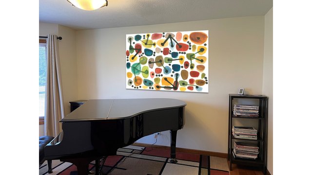
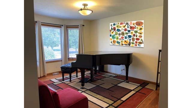
Dramatic:
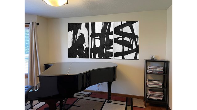
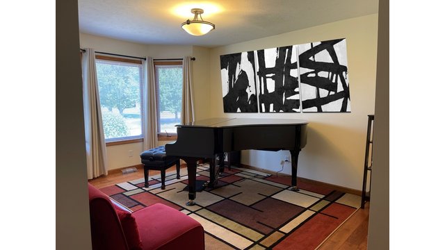
I can't decided which concept I like better... Mr. SK said he can't decide either. But one thing we thought was that thhe black and white set (it would actually three canvases) really doesn't match the abstract piano, so it might have to go... Whereas the colorful one kind of matches, or doesn't clash, the other pieces...
Anyway, art is hard (and you all might hate all of these pieces
 ) but if you have any suggestions about how to settle on a concept, I'd love to hear!
 -
I like that colorful piece, but I don’t think it plays nicely with your area rug, color-wise.
And I think a picture of a piano in the piano room may be redundant, but the colors play well with your area rug!
@AdagioM said in Help me think about how to decorate my piano room:
I like that colorful piece, but I don’t think it plays nicely with your area rug, color-wise.
Thanks for commenting AdagioM! Hmm, re the colors, there's reds, tans, creams and greens in the carpet, and there's a red chair... The photo makes everything in the room look a little more yellow than it is. I think if the artwork's coloring is fairly accurate to what I see on the website (Art dot com), it should work well with the colors in the room, but it's kind of iffy...
And I think a picture of a piano in the piano room may be redundant, but the colors play well with your area rug!
It does indeed. That abstract piano has lovely, rich colors.
-
So, I actually printed out the two options onto sheets of paper and taped them together.

If nothing else, it convinced me that I don't like the black and white one, so that's good to know.
I'm still on the fence about the colorful one, but Mr. SK likes it a lot.
Anyway, here are the photos. Unlike the photos above (which I did in powerpoint), here, I used painter's tape to attach the photos to the wall, and they are almost exactly to size (probably add an inch all around for the frame, and of course the real canvas pieces will have depth and stand out from the wall).
The black & white set
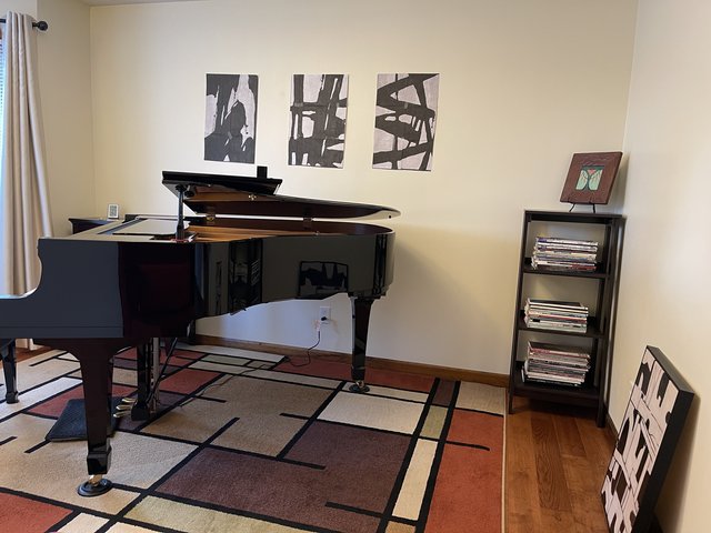
Here you can also see the black and white piece I already own (on the floor), I don't think these two go well together.
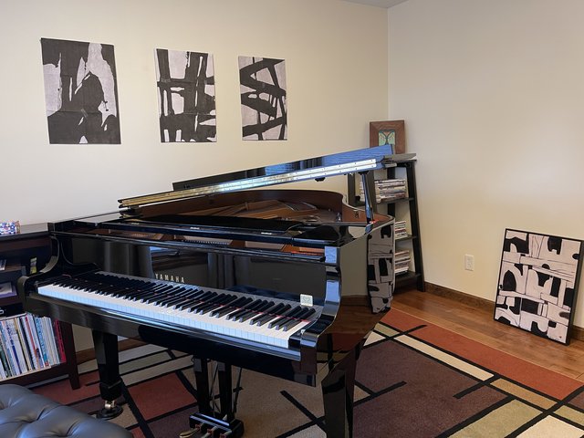
Here's the colorful one, mostly the actual size (but missing the frame and the depth of the real item)
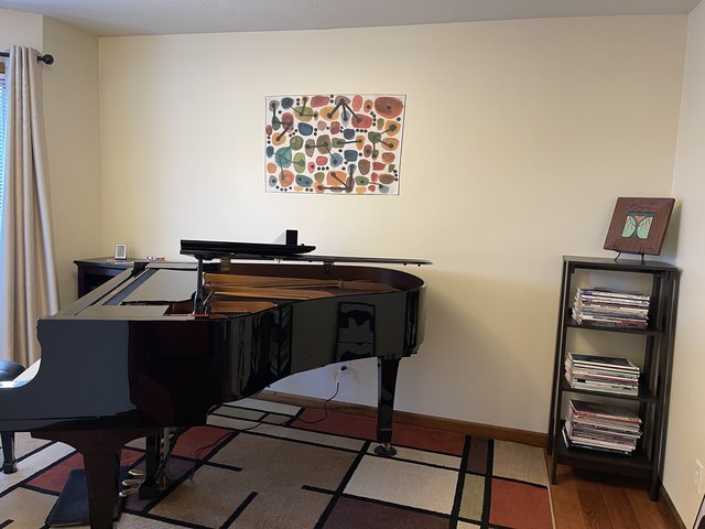
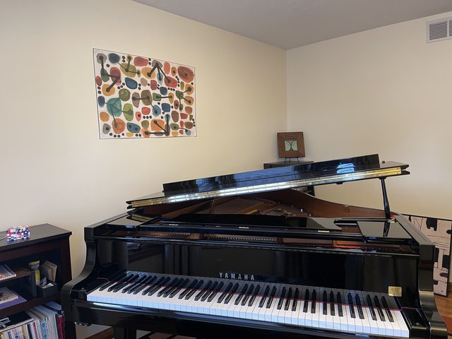
Panorama pic

Zoomed out pic
-
I am the farthest thing from an interior decorator so take this for what it’s worth (not much!). Get art you love. I never worry about whether it “matches” anything but buy pieces I love and then hang them. Sometimes I move pieces around when I redecorate because I think they work better in another space, but buying something to “go” in a space often means you end up with something kind of soulless.
-
We cross posted so I’m back! I think you need to go larger on that wall, or go for a bunch of smaller pieces to create a gallery wall. I think the original black and white looked great because it was scaled so large. The smaller versions don’t look balanced with the piano and size of the wall.
-
We cross posted so I’m back! I think you need to go larger on that wall, or go for a bunch of smaller pieces to create a gallery wall. I think the original black and white looked great because it was scaled so large. The smaller versions don’t look balanced with the piano and size of the wall.
Thanks for the advice Dol!
@dolmansaxlil said in Help me think about how to decorate my piano room:
I think you need to go larger on that wall, or go for a bunch of smaller pieces to create a gallery wall.
I was literally just looking at the price for the colorful piece one size up! It's more than twice as much
 (Also it might be too big, not sure.)
I could afford it, if that's what I decide to do... But if I get the size shown here, I have space to add more pieces!! Which is what we did in our old house.... Hmmm, I'll have to think on that. And ask Mr. SK what he thinks.
I think the original black and white looked great because it was scaled so large. The smaller versions don’t look balanced with the piano and size of the wall.
Yeah, that's the great thing about the black and white set, it has presence. But it's also kind of too gray, or something. The piece on the far left is too thick maybe....
Anyway, thank you for these comments! I'm not going to order today, I'll have to sleep on it...
-
I’m thinking along the same lines as @dolmansaxlil as far as scale is concerned. I’d go big. Or a gallery wall that covers a larger area.
I’m of mixed feelings about how to approach color and whether art should match. I’ve bought pieces that I loved in a gallery but couldn’t find a place that they looked like they fit in with the rest of the decor. I’ve also moved existing pieces around and sometimes find that something I’ve owned for years that looked "ok" where it's been hanging suddenly looks completely wonderful in a new way when I move it to a new location.
I love the colorful piece but like @AdagioM I’m not sure about how the colors and abstract look of the wall art works with the prairie style/stained glass look of the rug.
Hey, just experiment! Or wait and go to some summer art fairs and see if something grabs your attention. You may find the perfect piece when you aren't expecting to.
-
Yeah, I need to think on the colorful one... I wouldn't feel too bad if I got the medium sized version, and then moved it somewhere else. But if I buy the larger one, which is more than twice as much, and I don't think it would fit anywhere else if I wanted to move it!
 And I wouldn't want to get it and then not want it there...
 -
I think the smaller one is too small for the space, but I really think it’s the palette of colors that don’t work for me with your rug. Also, the style makes me think of mid-century modern (tel-star!) and your rug is more Craftsman/prairie style.
I agree that the black and white set doesn’t look right with your other black and white piece.
Of course, all of these opinions are from a person who has two cat portraits hanging in the living room and dining room! Gifted by the artists.
-
I do agree that you need bigger. Like the scale of your first photo of the black and white ones.
Not sure if you have a TJ Maxx/Homegoods/Marshalls/Ross type store near you.....they get closeouts so they can be hit or miss but they generally carry canvas prints in all different sizes including, sometimes, very very large (like can't fit in the car to take it home large) sizes. It might be worth a spin through one of those stores to see if anything catches your eye. The good thing about these stores is that not only are prices deeply discounted but you can take it home, see it in the room, and easily return it if you hate it.
And just FYI if you happen to fall in love with something that is too big for your car, you can rent a box truck for a few hours from home depot/lowes for $20.
Adagio - I would like to see those cat portraits now pretty-please?

-
The scale of the big black and white one, but that design is too much, it fights for attention with the rest of the room. Something subtler that compliments the rug. I would match colors, but that’s just me. I might even hang a beautiful quilt or a colorful old woven rug in that space.
-
But best advice is definitely @dolmansaxlil , hang art you love.
-
I kind of like art that fills up a wall. My mom did this needlepoint back in the 60s.
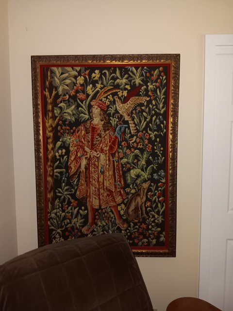
It is 3 feet wide and more than 4 feet tall. We have a ton of windows in our house, a lot of art, and not a lot of walls to hang it on. It deserves its own wall and really needs to be out of direct sunlight. The only place I could find to hang it was in the master bedroom. It would be better if the chair weren't there, but oh well...
Something this size and maybe even style could look good on the shorter wall that is in front of the piano. There are unframed tapestries that might also help with the sound dampening.
Here's one site:
https://www.walltapestry.com/store/c/20-Wall-Tapestries.aspx?Attribs=76
Also...the shelf unit with the music that's in the front corner...would it fit on the center of that short wall, again opposite the keyboard? I was thinking that it, with a nice piece of art above it would be nice to look out at as you play the piano. Or move the music elsewhere, and put a small table flanked by a couple of petite-sized chairs (maybe even dining chairs) for someone to sit and listen while you play, if you have people over for a party.
-
thanks for all the comments everyone, it's very helpful!!
I have definitely decided to go for something larger. The mock-up that I printed out was 36" wide, I think 48" or 52" would be much better, so that's what I'm going to look for.
WTG, I've been looking for a place to see tapestries, I don't know why I didn't find that one! Thanks!!
-
This is too dark, but I would love something like this
https://www.walltapestry.com/Modern-Shapes-Wall-TapestryBTW Lisa, thanks for the suggestion, we have a Home Goods store and an At Home store, so I think I'll make Mr SK take me shopping this afternoon!

-
@wtg said in Help me think about how to decorate my piano room:
not doing a second graphic in the room (rug being the first)
Yeah, I don't think that tapestry would work on any wall in there....
But that level of abstraction is what I'm going for, rather than something that is a recognizable object, if you see what I mean. IOW I don't want any animals, people, buildings, trees....
kinda limits what I can put in there...

