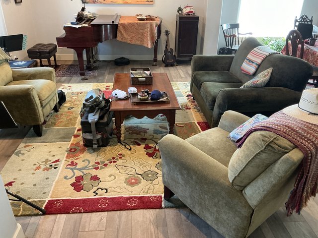
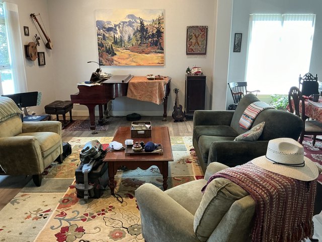
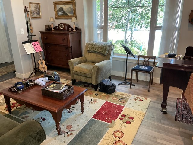
Help me think about how to decorate my piano room
-
Yeah, I need to think on the colorful one... I wouldn't feel too bad if I got the medium sized version, and then moved it somewhere else. But if I buy the larger one, which is more than twice as much, and I don't think it would fit anywhere else if I wanted to move it!
 And I wouldn't want to get it and then not want it there...
 -
I think the smaller one is too small for the space, but I really think it’s the palette of colors that don’t work for me with your rug. Also, the style makes me think of mid-century modern (tel-star!) and your rug is more Craftsman/prairie style.
I agree that the black and white set doesn’t look right with your other black and white piece.
Of course, all of these opinions are from a person who has two cat portraits hanging in the living room and dining room! Gifted by the artists.
-
I do agree that you need bigger. Like the scale of your first photo of the black and white ones.
Not sure if you have a TJ Maxx/Homegoods/Marshalls/Ross type store near you.....they get closeouts so they can be hit or miss but they generally carry canvas prints in all different sizes including, sometimes, very very large (like can't fit in the car to take it home large) sizes. It might be worth a spin through one of those stores to see if anything catches your eye. The good thing about these stores is that not only are prices deeply discounted but you can take it home, see it in the room, and easily return it if you hate it.
And just FYI if you happen to fall in love with something that is too big for your car, you can rent a box truck for a few hours from home depot/lowes for $20.
Adagio - I would like to see those cat portraits now pretty-please?

-
The scale of the big black and white one, but that design is too much, it fights for attention with the rest of the room. Something subtler that compliments the rug. I would match colors, but that’s just me. I might even hang a beautiful quilt or a colorful old woven rug in that space.
-
But best advice is definitely @dolmansaxlil , hang art you love.
-
I kind of like art that fills up a wall. My mom did this needlepoint back in the 60s.
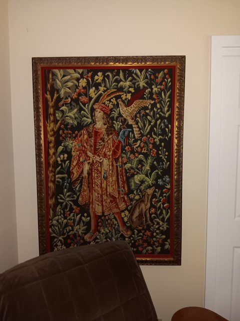
It is 3 feet wide and more than 4 feet tall. We have a ton of windows in our house, a lot of art, and not a lot of walls to hang it on. It deserves its own wall and really needs to be out of direct sunlight. The only place I could find to hang it was in the master bedroom. It would be better if the chair weren't there, but oh well...
Something this size and maybe even style could look good on the shorter wall that is in front of the piano. There are unframed tapestries that might also help with the sound dampening.
Here's one site:
https://www.walltapestry.com/store/c/20-Wall-Tapestries.aspx?Attribs=76
Also...the shelf unit with the music that's in the front corner...would it fit on the center of that short wall, again opposite the keyboard? I was thinking that it, with a nice piece of art above it would be nice to look out at as you play the piano. Or move the music elsewhere, and put a small table flanked by a couple of petite-sized chairs (maybe even dining chairs) for someone to sit and listen while you play, if you have people over for a party.
-
thanks for all the comments everyone, it's very helpful!!
I have definitely decided to go for something larger. The mock-up that I printed out was 36" wide, I think 48" or 52" would be much better, so that's what I'm going to look for.
WTG, I've been looking for a place to see tapestries, I don't know why I didn't find that one! Thanks!!
-
This is too dark, but I would love something like this
https://www.walltapestry.com/Modern-Shapes-Wall-TapestryBTW Lisa, thanks for the suggestion, we have a Home Goods store and an At Home store, so I think I'll make Mr SK take me shopping this afternoon!

-
@wtg said in Help me think about how to decorate my piano room:
not doing a second graphic in the room (rug being the first)
Yeah, I don't think that tapestry would work on any wall in there....
But that level of abstraction is what I'm going for, rather than something that is a recognizable object, if you see what I mean. IOW I don't want any animals, people, buildings, trees....
kinda limits what I can put in there...
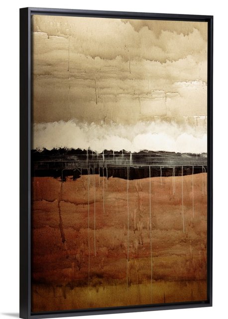
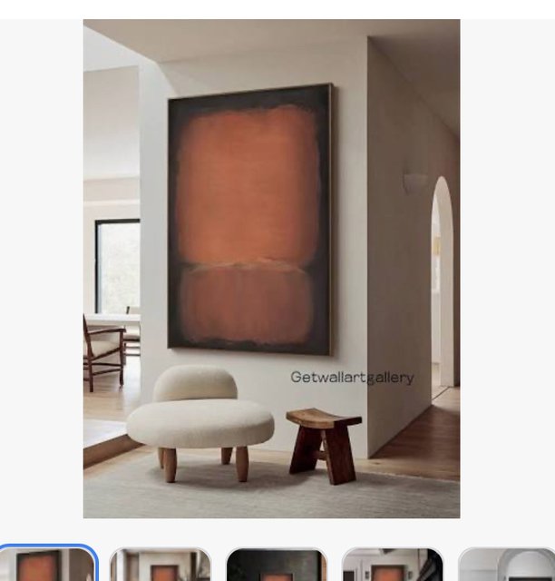
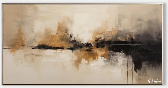
I would be going with an abstract that has less “energy” than the ones you have posted (if that makes sense). Something more restufl. These all have a landscape feel to them(because of the horizon line) but there are more abstract ones that this. I like the longer width, shorter height on your wall, wish that first one was wider (and didn’t have so many drips, I’m not a fan of lots of drips.
 )
)
-
Nope, no still lifes and nothing so well known as the Wave, not for this wall.
I know I'm a little persnickety...
 but it makes it pretty fast to rule things out! The tapestry site doesn't have a lot that would work for me, not for this wall anyway, but I'm keeping that site on my list.
@Jodi those are nice, but too brown
 I was looking at some Rothkos that I liked, but the ones I liked were red, and they were too red.
  And Mr. SK told me that a Miro print that I love, which is mostly blue, is too blue.
Did you get those photos from a site that sells prints?
Your comment about "energy" is interesting, and I think that's a really helpful way to think about the different options I've been seeing. (The black three piece in my OP has way too much angry energy!)
-
Lol, I was going for a carpet match!
 I feel like the piano is the most important thing in that room. You have a lot of energy under it in that rug. Whatever is on the wall should compliment that, not compete for it. (in my opinion). However, I have a wild rug on my floor, and an equally wild painting on the wall over my piano, and I love them both, lol. I’ll take some pictures.
 -
Lol, I was going for a carpet match!
 I feel like the piano is the most important thing in that room. You have a lot of energy under it in that rug. Whatever is on the wall should compliment that, not compete for it. (in my opinion). However, I have a wild rug on my floor, and an equally wild painting on the wall over my piano, and I love them both, lol. I’ll take some pictures.
@Jodi said in Help me think about how to decorate my piano room:
Lol, I was going for a carpet match!
Jodi

There's too much brown in the house (all the trim is brown etc) so I don't want to add any more.
And yes, the rug has a lot of brown, but I focus on the red parts.
 and hope that the red chair accentuates that.
@Jodi said in Help me think about how to decorate my piano room:
However, I have a wild rug on my floor, and an equally wild painting on the wall over my piano, and I love them both, lol. I’ll take some pictures.
Actually, I really like the idea of wild on wild. Maybe that's why I like the colorful print that no one else seems to like -- well, Mr SK decided he liked it once I taped the sample printout up on the wall. And he agreed that if I get that print, I should get the bigger one (either 48" or 52' wide)
Please share photos when you can!

-
@Jodi said in Help me think about how to decorate my piano room:
Lol, I was going for a carpet match!
Jodi

There's too much brown in the house (all the trim is brown etc) so I don't want to add any more.
And yes, the rug has a lot of brown, but I focus on the red parts.
 and hope that the red chair accentuates that.
@Jodi said in Help me think about how to decorate my piano room:
However, I have a wild rug on my floor, and an equally wild painting on the wall over my piano, and I love them both, lol. I’ll take some pictures.
Actually, I really like the idea of wild on wild. Maybe that's why I like the colorful print that no one else seems to like -- well, Mr SK decided he liked it once I taped the sample printout up on the wall. And he agreed that if I get that print, I should get the bigger one (either 48" or 52' wide)
Please share photos when you can!

@ShiroKuro said in Help me think about how to decorate my piano room:
Maybe that's why I like the colorful print that no one else seems to like
For the record, I really like that colorful print. But not in the same room with the rug. There's a stylistic difference between the two my brain can't get past.
One thing I've learned over the years is that I like a lot of different styles and color combinations. My problem is picking one and sticking with it! I've bought all kinds of things I love but they don't play well together.
But art and design are such personal things, and we all have to follow our inner muses...
-
@ShiroKuro said in Help me think about how to decorate my piano room:
Maybe that's why I like the colorful print that no one else seems to like
For the record, I really like that colorful print. But not in the same room with the rug. There's a stylistic difference between the two my brain can't get past.
One thing I've learned over the years is that I like a lot of different styles and color combinations. My problem is picking one and sticking with it! I've bought all kinds of things I love but they don't play well together.
But art and design are such personal things, and we all have to follow our inner muses...
@wtg said in Help me think about how to decorate my piano room:
There's a stylistic difference between the two my brain can't get past.
Yeah, it makes me a little nervous that this (the stylistic difference) doesn't bug me...
I may be waaay too used to my rug, to the point where I barely notice the design anymore and focus mostly on the warm rich colors of it....
Maybe it's like the person who wears too much perfume all the time. She no longer notices it, but no one wants to get on the elevator with her.
I don't want my piano room to be that elevator.
-
The rug was initially bought for the piano/living room - to match the chairs and the red that I love. Then I hung that painting over the piano in one of the next houses (and loved it), but the rug and the chairs that matched were in another room. Then in this house, I just put them all together, and it makes me happy. My walls are filled with vintage paintings, and my own paintings, and lots of antique furniture, some built by my relatives.
