Help me think about how to decorate my piano room
-
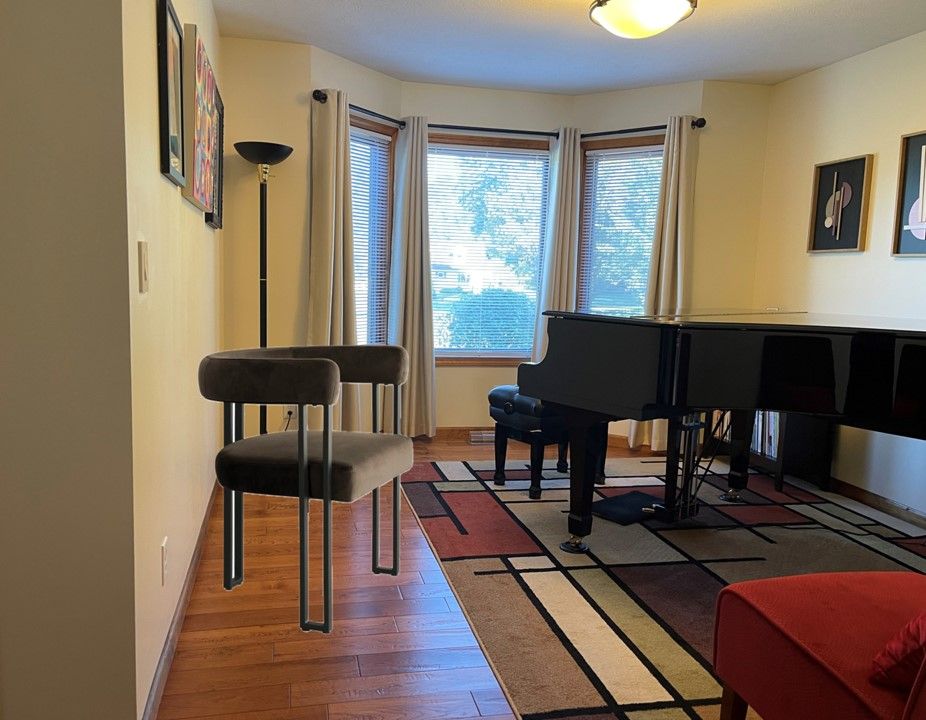
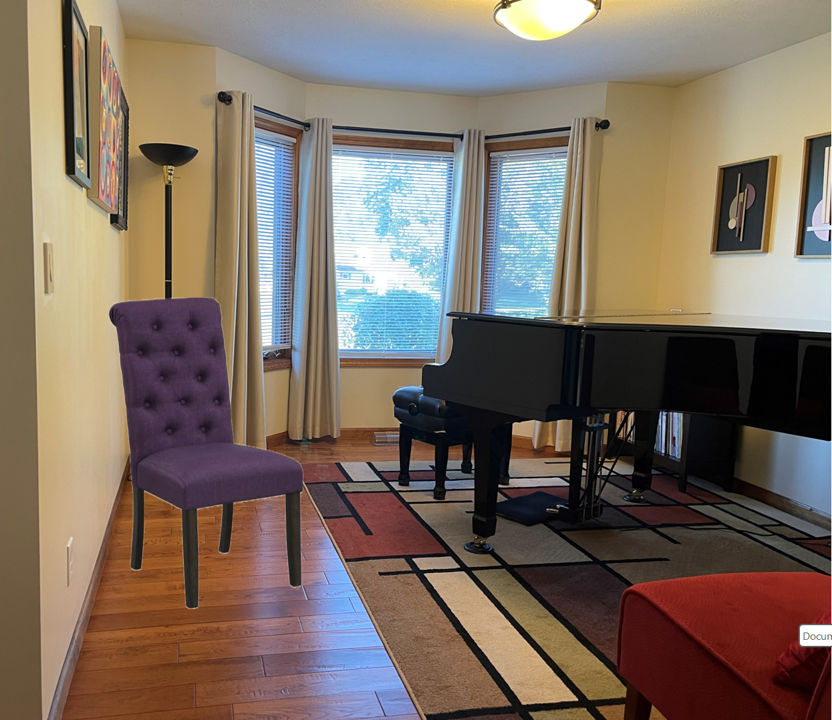
I would not go with light beige/cream - I think you want something that stands out a bit against your walls - plus they get dirty fast. I like the idea of black or dark gray. Red would work but the other chair is red and you don't want to look like you tried to match and failed so you'd need to be careful about the shade.
One of the shades of brown or green from the rug would work well I think or even the tan in the rug. A brown like this could work (and they also come in green!) : https://www.wayfair.com/furniture/pdp/latitude-run-dulcine-velvet-upholstered-armchair-set-of-2-w110770525.html?piid=1191181425
I like the geometric shape of those too - it picks up the straight lines in the rug and it echoes the feel of those 3d art pieces (the semicircles and lines) with the round cushions and back and the straight square legs.I would check out the AtHome store - they may have some chairs as well with an easy return policy for the win!
@Lisa said in Help me think about how to decorate my piano room:
I would not go with light beige/cream - I think you want something that stands out a bit against your walls
I think you're right. I've been playing around with C&Ping chairs onto a photo of my room, and the light colored ones are blah.
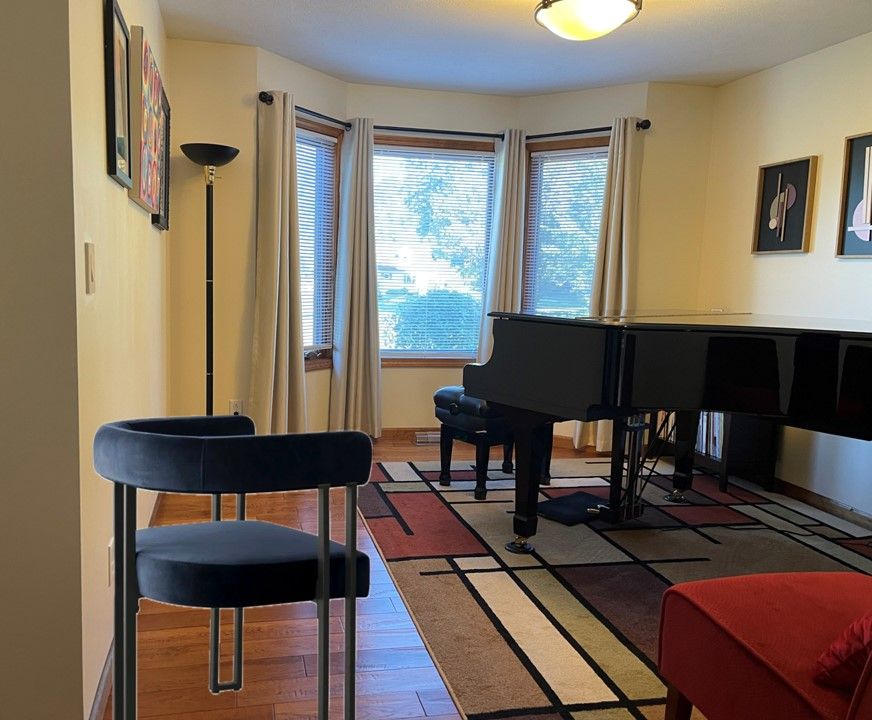
I love that chair you linked from Wayfair! I actually wonder if that blue would work, given how dark it is, and the black frame... lemme grab a photo....
-
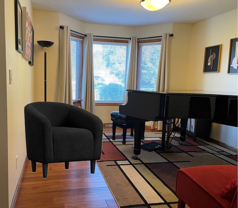
@ShiroKuro i like that shape against the rectangles in your rug.
-
@Steve-Miller the round one right? I do too!!
-
@Steve-Miller the round one right? I do too!!
@ShiroKuro Yes. The round one.
-
I think @Lisa is spot on about everything. She needs to consider a career in interior design!
Another vote for the round one. I'm guessing the height is similar to the red chair, which I think would look balanced.
If you go with a color for the chair, I would consider the rug and the red circles art when making my choice.
-
Visually speaking, I like the one that @Lisa posted, the one with the metal frame and open sides. It looks less bulky than the one you just posted, even if they have the same footprint, which might be good if you're trying to make things look less crowded. Read: Keep Mr SK happy.
The lines of the metal frame in Lisa's chair mirror the lines in the rug.
As far as comfort, the only way to know is to sit in each.
-
Did you look at the green? It looks close to the green in your rug....the reviews say it is a "nice olive"
Not a fan of the blue. It doesn't match anything else and the cool blue is the opposite spectrum of all the warm earthy tones you have going on in there.
-
The chair description says the legs are "sanded black matte" for all of them, so it might just be quirks of the lighting in the photo that's making them look lighter on some of the colors. It looks like they come disassembled anyway, so if the legs aren't as black as you want them, a can or two of spray paint could easily take care of that before you assemble them.
-
Yes, agree the blue would add a whole different dimension in a room that has a lot going on but that looks cohesive.
I'm a chicken so I'd probably go with brown. Do you have a sense how the green might look with the red circles art that would be hanging above it?
-
I had a hard time seeing the color of the green in the listing with just the chairs. There is a dining room set available with the same chairs, and I found the pic there of the set with the (olive) green chairs to have a better color rendering.


