Color theory
-
Published in 1766, The Natural System of Colours by Moses Harris, is a significant work in the history of color theory. Harris proposed that all colors are derived from three primary colors: red, blue, and yellow. He meticulously explored how these “primitives” could be combined to create a vast array of tints. His work featured two groundbreaking color wheels: the “Prismatic” wheel, based on the colors of the rainbow, and the “Compound” wheel, which demonstrated the relationships between secondary and tertiary colors.
Harris’ system was not only theoretical but also practical, aiming to provide artists and dyers with a systematic approach to color mixing. He emphasized the importance of understanding color relationships and the harmonious connections between different hues. While some of his ideas have been refined by later scientific discoveries, The Natural System of Colours remains a valuable contribution to our understanding of color and its organization.
At only nine written pages (including a title and dedication) it was a short treatise but its depiction of color wheels had a lasting impact.
https://www.c82.net/natural-colors/?utm_placement=newsletter&user_id=66c4c06e5d78644b3aab4472
-
Color mixing is pretty cool. To mix all the colors you actually need a slightly different looking triad than what is talked about here (plus black) for your paints - the same triad they use in printing color - cyan (a turquoisey blue), magenta (kind of a pink) and a clear not too warm, not too cool yellow. Or you make sure you have two reds (one that leans towards orange and one that leans towards pink/violet ) two blues - one that leans towards purple and one that leans towards green (like ultramarine and phthalo) and a really clean yellow. Reds that tend towards orange do not make bright clean purples when mixed with blue, but reds that tend towards pink do. Not to say the other purple isn’t nice, it just may not be what you want. -
It was supposed to say this: Color mixing is pretty cool. To mix all the colors you actually need a slightly different looking triad than what is talked about here (plus black) for your paints - the same triad they use in printing color - cyan (a turquoisey blue), magenta (kind of a pink) and a clear not too warm, not too cool yellow. Or you make sure you have two reds (one that leans towards orange and one that leans towards pink/violet ) two blues - one that leans towards purple and one that leans towards green (like ultramarine and phthalo) and a really clean yellow. Reds that tend towards orange do not make bright clean purples when mixed with blue, but reds that tend towards pink do. Not to say the other purple isn’t nice, it just may not be what you want.
-
I love color. One of my favorite books is "The Secret Lives of Color" by Kassia St. Clair. It's a fascinating exploration of several individual colors.
The Secret Lives of Color tells the unusual stories of seventy-five fascinating shades, dyes, and hues. From blonde to ginger, the brown that changed the way battles were fought to the white that protected against the plague, Picasso’s blue period to the charcoal on the cave walls at Lascaux, acid yellow to kelly green, and from scarlet women to imperial purple, these surprising stories run like a bright thread throughout history.
https://www.averbforkeepingwarm.com/products/the-secret-lives-of-color-by-kassia-st-clair
-
wtg, interesting!
Bernard, thanks for the recommendation.
Jodi, I enjoyed reading your post. My mother was an artist.
Jim and I had a good natured argument about the color violet. He said it was a derivative of blue. I said it was a derivative of purple. I think I was right. I don't know. Interestingly enough, his sister said there was no right answer. I'm pretty sure his sister was wrong.
My favorite memories of colors were seeing the Cullinan diamonds in the Tower of London and the rainbows in Hawaii.
My main Internet in color has to do with the colors and light properties of gems.
My favorite experiences of colors are looking at pictures of the highest quality chrysoprase (my favorite color), late 19th century amethysts from the now defunct Russian mines, the highest quality red spinels, and the highest quality aquamarines.
I'm not a visual artist myself. I'm a lot better at processing words and music.
-
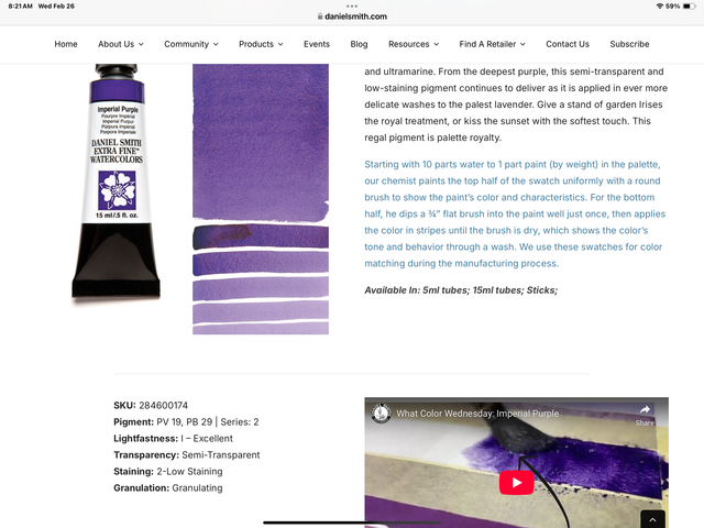
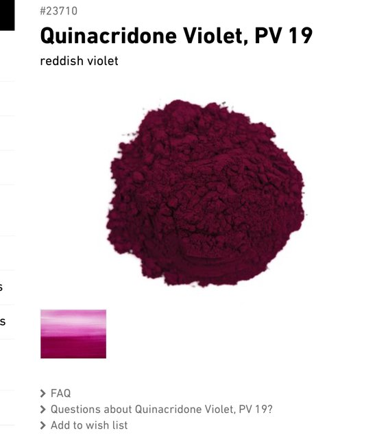
Daniel - color word names are tricky - they don’t always bring up the same meaning or color to each person. The color violet comes from the name of the viola flower. I would say violet and purple are the same color. As an artist, there are red violets and blue violets - sometimes it’s easier to think of colors in terms of the pigments that make them. That can be complicated too, you can have a paint color purple that is made from a single pigment - like the synthetic pigments manganese violet and dioxazine purple, or the natural pigment Tyrian purple, that comes from the innards of about 10,000 sea snails. OR, you can have tubes of purple paint that are mixtures of 2 or more pigments, like the one in the picture - it’s a mix of PV19 (pigment violet 19, it’s a red violet) and PB29 (pigment blue 29, which is synthetic ultramarine blue, the same chemistry as the WAY more expensive natural pigment made from Lapis Lazuli). There is a reason purples and blues were reserves for for royalty in ancient times - they were incredibly difficult and expensive to get. Now ultramarine blue is one of the least expensive pigments to purchase. Bonus that it’s also lightfast and non-toxic.
-
@Jodi said in Color theory:
What the heck is wrong with my post…

I was curious, too, and pulled up your post in edit mode and copied the text. Then I pasted it into a new post. I noticed that there seem to be a few spaces in front of the first word "Color". I deleted those and the post went back to normal when I looked at it in Preview mode. Seems like there are some (invisible) control characters at the beginning that cause that very interesting way to display the text! I'll have to ask @Axtremus if he knows what happened...
Anyway, carry on!
-
I have not read the book Bernard linked to but have heard good things about it. Here’s one I do own - it’s called “Chromatopia - an Illustrated History of Color”. Here’s a YouTube video where someone flips through it.
Link to video -
This is the best example of chrysoprase I've seen and the craftsmanship of the jewel is equal to it.
This is a rare example of a woman's ring I'd wear and wear every day without a second thought.
-
This Victorian necklace has amethysts from the defunct Russian mines. Amethysts were one of the most valued of all gems during the Victorian period.
https://www.langantiques.com/victorian-amethyst-riviere-necklace.html

Hello! It looks like you're interested in this conversation, but you don't have an account yet.
Getting fed up of having to scroll through the same posts each visit? When you register for an account, you'll always come back to exactly where you were before, and choose to be notified of new replies (either via email, or push notification). You'll also be able to save bookmarks and upvote posts to show your appreciation to other community members.
With your input, this post could be even better 💗
Register Login