pj is here
-
Not really crazy about this web site. A bit sparse and minimalist. I suppose after you get used to it, it's okay. But I find it a bit jarring on first impression.
-
This site can do a couple if things that I cannot get the other site to do:
- Drag-and-drop image posting, no need for 3rd party hosting, even with automatic resizing for images that are "too big", example:
- Twitter embedding:
-
Is this one more mobile and tablet friendly?
-
The image posting feature is nice. The 3rd party hosting solution we have at the current WTF is awkward and I think keeps a lot of people from posting stuff. Or I have to keep resizing their photos when they're too big.
-
Oh ... individual users can select different "themes" or "skins" if you don't like the default.
-
I was just looking for theme options but couldn't find where to change them. Are they pre-loaded for the forum, or is that something an admin does and then users can select from that list?
Sorry about all the newbie questions....my technology skills date back to mainframes.....
-
- At the top-right corner, clicks on your avatar (now it's probably just your initial in a circle because you have not selected an avatar picture)
- Select "Settings"
- Pretty much one of the first things you see would be "Select a Skin"
-
-
-
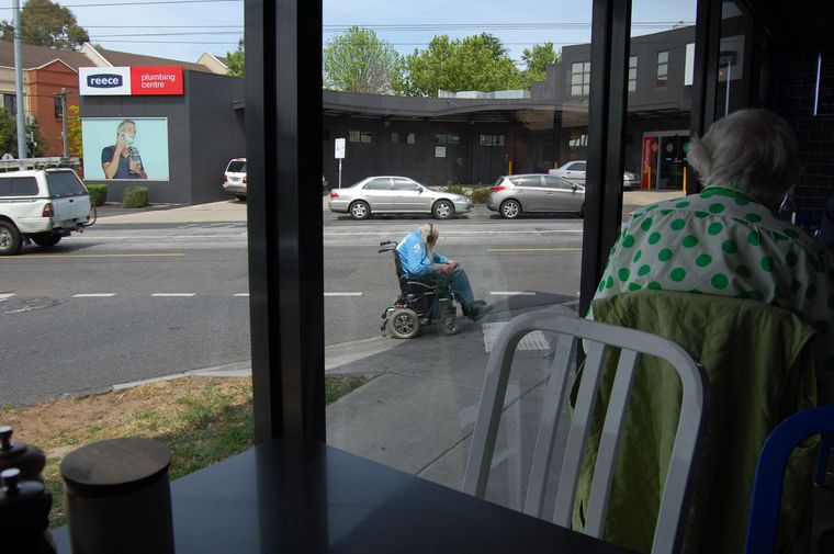
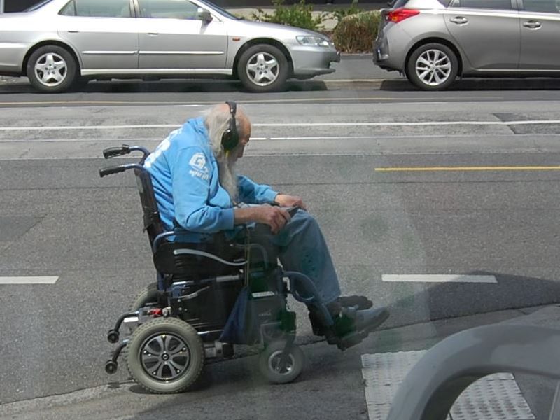
Note: This is not me. This may be a picture of me from 30 years into the future. It was just a random picture out the window of a restaurant in Melbourne.
-
I assume the gentleman is listening to Scarlatti. Or maybe Jethro Tull.
-
-
I switched to the Darkly skin. I like the dark background and the colors that are used. Easier to read the format.
It's also easier to read on an iPad than either Groupee or Ax's other forum.
-
I guess I can learn to hang with this one.
-
I tried the Chat feature. Different than the PM function I'm accustomed to but I think it's OK.
-
This post is deleted! -
Playing with the skins. Really like dark backgrounds but sometimes there is insufficient contrast with the text, so the text disappears. Am also finding the reverse problem with light backgrounds, where the text is light also resulting in something that's hard to read.
Can admins tweak the skins and/or add new palettes that aren't in the currently available list?
-
Ha! I think I found where the skins are coming from. If you click on "Themes" you get a drop down that lets you select various themes and see how it will look for various elements.
-
Now I am here on my iPad.
-
@wtg said in pj is here:
Is this one more mobile and tablet friendly?
In my subjective opinion, yes.